EA_Aljo Community Manager
Community ManagerCommunity ManagerAfter the patch, playing overtime in DEL Season Mode is now 4on4 which is wrong.
Should be 3on3
Please fix
Community ManagerThanks for the report. I'll pass this on to the team.
FYI. It looked there is now a roster update that was released that does have the jerseys.
Community ManagerHey, everyone. You can go to Rosters > Active Roster and then download the update from November 4th. That has the new jerseys.
@EA_AljoJust made a post about how the Islanders Reverse Retro Jersey is wrong. Can you take a look and raise it to the devs?
I’m very disappointed. Was looking forward to rocking them in HUT but can’t because of how wrong they are.
@Sparky_NY1 Guess what? No seat color change in the update AND our Reverse Jersey is horribly wrong.
(CM: Posts shared in a row have been merged. Check out this post for tips on how to edit and add more to a post.)
that worked for the jerseys however there are so many issues. colors off and the sizing of logos is all over the place.
I'm confused as to why EA has such an issue with logo sizing. You can see that between the NHL and create a team logos drastically.
They did not add Toronto's Black Alternate or Buffalo's Black Goathead jersey.
I still don't understand why EA can't just add all teams historic jerseys. There are soo many missing.
Lastly, why does EA not add these new jersey styles and logos to Team Creation. It does not take that much added work.
Please pass along.
Community ManagerIf you have any screenshots you want to pass on, that would be appreciated. Thanks.
Here are a few examples. Logo position and size are not standardized correctly.
Do I have to point out the obvious here?
Community ManagerDo you have any screenshots comparing them to the in game versions?
No improvements to the penalty button... I mean sticklift? IMO, if you're AHEAD of the opposing player and have body positioning on him, it should never be a penalty. Hooking/slashing penalties should only be possible from behind.
You could then balance the effectiveness of the stick-lift (and the chances of it succeeding) using the players' strength attribute. Let's say the player without the puck has a much lower strength rating: if he's in good position, he'll get the stick-lift off successfully but the other player will get his stick down quicker and regain control of the puck. I think this would be an interesting system that adds depth to the mechanic while balancing it AND avoiding unrealistic penalties.
@EA_Aljo wrote:
If you have any screenshots you want to pass on, that would be appreciated. Thanks.
@EA_Aljo here is a better comparison. These are way off, it would be amazing if you could get these updated! Thank you
@EA_Aljo wrote:
Do you have any screenshots comparing them to the in game versions?
@EA_Aljo Yup, just posted another one in an easier collage format.
(CM: Posts shared in a row have been merged. Check out this post for tips on how to edit and add more to a post.)
Community ManagerIs the one on the lower right the in game version? If so, it would be good to see more of the jersey.
@EA_Aljo I have attached a comparison shot for the away (white) jerseys as well. All of the trim here is a completely different color as well as the crest is different.
see attached comparison for all reverse retro jerseys in game and the actuals.
Community ManagerIs the issue that the logo appears to be a little bigger in game?
Thank you.
It's absolutely baffling that there was no fix to the stick lift
Will we get Reverse Retro 2020–21 and 2022–23 jerseys and Reverse Retro logos at some point, to creation zone?
@EA_Aljo wrote:Is the issue that the logo appears to be a little bigger in game?
Thank you.
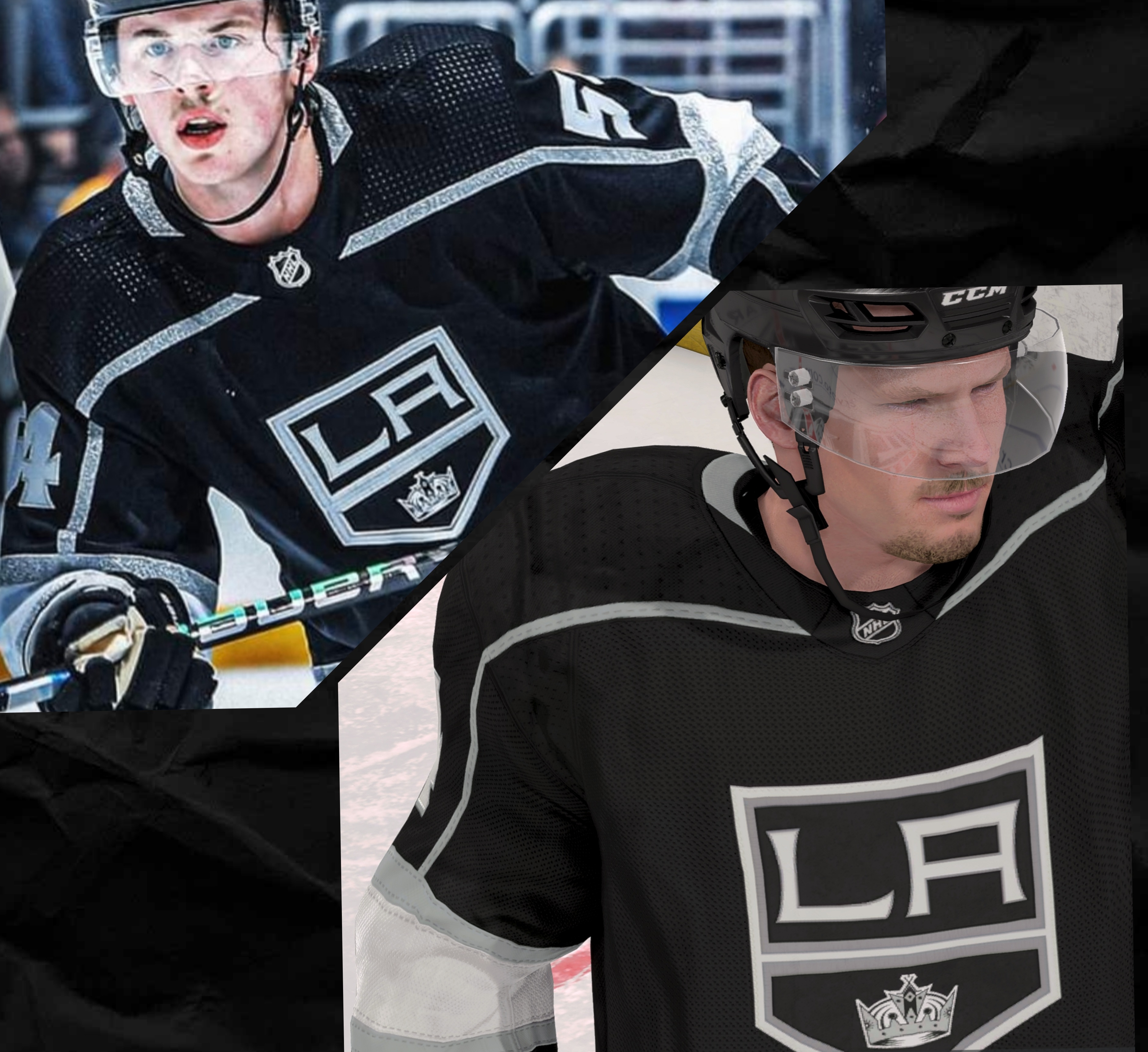
@EA_Aljo The issue is that it's not accurate to the authentic uniform worn in real life. The Kings haven't used that gray color in 3 years. The logo itself isn't accurate it's design in game is incorrect. You can see this? The entire jersey is inaccurate except for the fact that it's black or white and the letters LA on it.
Community ManagerI'll pass on these details.
@Juhani_91_91 wrote:
Will we get Reverse Retro 2020–21 and 2022–23 jerseys and Reverse Retro logos at some point, to creation zone?
I don't have any details on this. If I find out, I'll let you know.
EA really should hire people with graphic design experience in addition to coding. So many oversights. This is just for RR 2.0. The regular jerseys have alot of issues as well not in this list. Anyone is welcome to add to this.
Anaheim Ducks- Diagonal line thickness is off for both brown and gold. no orange at collar.
Arizona Coyotes-
Boston Bruins-
Buffalo Sabres- Goathead size is off and not centered properly.
Calgary Flames- shade of red is off.
Carolina Hurricanes- size of hurricane flag trim on bottom is too narrow making the contrast not enough.
Chicago Blackhawks- red is off and wrong font on the name.
Colorado Avalanche- blue, red and yellow shade are all incorrect.
Columbus Blue Jackets- light blue is wrong shade.
Dallas Stars- size of stars logo is too small. no detail on the star like the real one.
Detroit Red Wings- text isnt centered and line spacing is wrong.
Edmonton Oilers- blue color is wayy off! Logo size slightly off.
Florida Panthers- logo should be larger. red should be brighter.
Los Angeles Kings- purple shade wrong. Trim lines at bottom wrong size.
Minnesota Wild-
Montreal Canadiens- blue should be brighter. logo size is off compared to all other Canadians jerseys.
Nashville Predators- sleeve is all wrong design. yellow in game too golden.
New Jersey Devils- - shoulders in game wrong. trim lines on bottom of jersey wrong as well. the blue and reds are off.
New York Islanders- logo size is off. blue should be darker. orange trim lines in wrong location and size off.
New York Rangers- fix to the correct red.
Ottawa Senators- logo size and location are off. red is wrong shade.
Philadelphia Flyers- logo size and correct the shade of orange. Too much black at the shoulders compared to real jersey.
Pittsburgh Penguins-logo size and shade of yellow
San Jose Sharks- Font is wrong size and shape. Where are the white skates? Bottom trim lines wrong size.
Seattle Kraken- Color and line detail way off. Where are the adidas 3d logo details?
St Louis Blues- yellow is slightly too bright and the blue is completely wrong. should be closer to a powder blue. trim line at bottom are off as well.
Tampa Bay Lightning- logo too small.
Toronto Maple Leafs- wrong jersey type was used. blue is off. shoulders wrong and trim wrong.
Vancouver Canucks- bottom trim lines wrong. Fix all color shades.
Vegas Golden Knights
Washington Capitals-
Winnipeg Jets- aviator blue slightly too bright.
@EA_Aljo wrote:I'll pass on these details.
@Juhani_91_91 wrote:Will we get Reverse Retro 2020–21 and 2022–23 jerseys and Reverse Retro logos at some point, to creation zone?
I don't have any details on this. If I find out, I'll let you know.
@EA_Aljo thank you! Keep your chin up! Everyone venting is tough I'm sure, just keep passing that feedback. All we can do is hope the bosses go with it!
Community Manager
@beastm0de2311 wrote:
@EA_Aljo thank you! Keep your chin up! Everyone venting is tough I'm sure, just keep passing that feedback. All we can do is hope the bosses go with it!
You're very welcome! Thank you as well!