Forum Discussion
ndeeka wrote:
please feel free to show it off when youre done :)Grumpstown wrote:
ndeeka wrote:
i would say try a mix of both^^ what i like from your first design is the market and the flowers behind it (except the rainbow tree, i kinda just dont match imo)
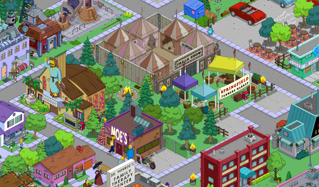
I first designed this...
https://lh3.googleusercontent.com/-epEOHdpZbEM/VXc9wixuNcI/AAAAAAAAAGs/8N-TRs2b0Do/s800/Screenshot_2015-06-09-19-58-27.jpg
...but I was not completely satisfied, so I changed to this...
https://lh3.googleusercontent.com/-hcbnRJ4HafQ/VXc9ye5HK9I/AAAAAAAAAG0/ga9eDhrPR3Y/s800/Screenshot_2015-06-09-20-20-33.jpg
...which I like more, however still not entirely happy with it, but can't put my finger on it.
Suggestions?
out of the second design, i dont really like the placement of the market, but i DO love the flower formation, its looks very nicely placed. the outhouse seems kinda off in both designs^^
e: spellcheck xD
Thanks for your comments. I've moved the Market to it's first location and the rainbow tree has gone.
I also got rid of the grocery. It was to distracting and that was what was actually bothering me. I was hoping that the combo would work, but it doesn't. As it's replacement I moved in my second Market. Still need to do some fiddling, but it already looks better.
Your remark on the smoke house is noted, but I'll keep it (although less obvious).- squeezed mine in downtown. Foodtruck Wednesdays
http://i.imgur.com/HrUY1Rnl.png - http://imageshack.us/a/img631/4919/3rZAKg.jpg
- 4junk3000New Spectator
4junk3000 wrote:
My market is at the drive-in during the day. I want to fill the surrounding lot with corn. I doubt I'll get enough at this price though. I made the drive-in just for the market. Reminds me of the Starlight in Atlanta, which I go to often!
http://i.imgur.com/spdQPj4.jpg
Made some improvements since this post...
http://i.imgur.com/SoeAIg3.jpg
About TSTO Creative Corner
Show your Springfield to the The Simpsons: Tapped Out community!
1,351 PostsLatest Activity: 2 years agoRelated Posts
Recent Discussions
- 19 days ago
- 2 months ago
- 3 months ago
- 3 months ago
- 4 months ago
