Assignment 1Theme:Time for the first assignment already?! It's crazy how fast this comp has taken off! So since we've got so many people, we need A LOT of songs. And what has more great songs than the 90's?! (BTW: the answer is nothing)
So this week is I <3 the 90's. All the songs were selected off VH1's 100 greatest hits of the 90's list and TOTALLY ROCK. There will be no elimination this round so everyone new can get a feel for how this competition works. Let's get it started!
Due Date: Saturday, September 15th @ 5pm EST
Elimination: None for this roundNumber Draw:#1 - Plateinmyway - Waterfalls - TLC
#2 - Aclavo - Only Wanna be With You - Hootie & the Blowfish
#3 - Aalyoko - Whatta Man - Salt N' Pepa
#4 - K3nnedy05 - Wonderwall - Oasis
#5 - Shadowninja2 - Genie in a Bottle - Christina Aguilera
#6 - 435q - Say My Name - Destiny's Child
#7 - JewittAlex - Ice Ice Baby - Vanilla Ice
#8 - Rinxes - Tearin' Up My Heart - NSYNC
#9 - ArtistByNight - MMMBop - Hanson
#10 - Itsbriloves - I Want it That Way - Backstreet Boys
#11 - Alathria - Losing My Religion - R.E.M.
#12 - Cinderpelt - Good Riddance - Green Day
#13 - iAct1813 - Creep - Radiohead
#14 - Dancerbakersimlove - Vogue - Madonna
#15 - JessyxDavidson - Smells Like Teen Spirit - Nirvana
#16 - Slahp4 - Killing Me Softly - The Fugees
#17 - Natrules12 - My Heart Will Go On - Celine Dion
#18 - Rubygal25 - I Will Always Love You - Whitney Houston
#19 - Eggy900 - Baby One More Time - Britney Spears
#20 - What_Red - No Diggity - Blackstreet
EntriesAlathria - Losing My Religion (R.E.M.)
http://i35.servimg.com/u/f35/17/05/94/14/screen21.jpg
I'm choosing my confessions
Trying to keep an eye on you
Like a hurt, lost and blinded fool, fool Aalyoko - Whatta Man (Salt N' Pepa)
http://img401.imageshack.us/img401/8/whattaman.png
I know that ain't nobody perfect,
I give props to those who deserve it
And believe me y'all,
He's worth itPlateinmyway - Waterfalls - TLC
http://i.imgur.com/hFmpE.jpg
What a shame
You shoot and aim for someone else's brain
You claim the insaneArtistByNight - MMMBop - Hanson
http://i.imgur.com/3MH3u.jpg
So hold on the ones who really care
In the end they'll be the only ones there
And when you get old and start losing your hair
Tell me who will still care Slahp4 - Killing Me Softly - The Fugees
http://i47.tinypic.com/2hi1nrd.png
I felt he found my letters
And read each one out loud
I prayed that he would finish
But he just kept right onAclavo - Only Wanna be With You - Hootie & the Blowfish
http://i1247.photobucket.com/albums/gg629/aclavo/2c2f829e.jpg
I just wanna love you,
but you wanna wear my ring,
well there's nothin I can do,
I only wanna be with you.K3nnedy05 - Wonderwall - Oasis
http://i1059.photobucket.com/albums/t431/KilljoyCourtz/Screenshot-2-1.jpg
Because maybe
You're gonna be the one that saves me
And after all
You're my wonderwallRinxes - Tearin' Up My Heart - NSYNC
http://i.imgur.com/vrWCj.png
It's tearin' up my heart when I'm with you
But when we are apart I feel it too
And no matter what I do I feel the pain Shadowninja2 - Genie in a Bottle - Christina Aguilera
http://i.imgur.com/1Pblk.jpg
If you wanna be with me, baby there's a price to pay
I'm a genie in a bottle, you gotta rub me the right way
If you wanna be with me, I can make your wish come true
You gotta make a big impression, I gotta like what you doItsbriloves - I Want it That Way - Backstreet Boys
http://i45.tinypic.com/2qxrvys.jpg
Now I can see that we're falling apart,
From the way that it used to beEggy900 - Baby One More Time - Britney Spears
http://i1253.photobucket.com/albums/hh599/eggy900/Screenshot-3045.jpg
My loneliness
Is killing me (and I)
I must confess
I still believe JewittAlex - Ice Ice Baby - Vanilla Ice
http://i1116.photobucket.com/albums/k566/carlswhite/modelling%20comp/Screenshot-180.jpg
Dance, Bum rush the speaker that booms
I'm killin' your brain like a poisonous mushroom
Deadly, when I play a dope melody
Anything less that the best is a felony iAct1813 - Creep - Radiohead
http://24.media.tumblr.com/tumblr_maeq99X5E11qlo2bto1_500.jpg
I don't care if it hurts / I want to have control / I want a perfect body / I want a perfect soulJessyxDavidson - Smells Like Teen Spirit - Nirvana
http://i48.tinypic.com/dm7a7k.png
And I forget just why I taste
Oh yeah, I guess it makes me smileRubygal25 - I Will Always Love You - Whitney Houston
http://i47.tinypic.com/112ai9s.png
Bittersweet memories/that is all I'm taking with me./So, goodbye. Please, don't cry.
/We both know I'm not what you, you needScoresNew cycle, new competitors....new scores! The first round is always my favorite since no one gets eliminated. Just good old fashioned fun. Just like in cycle one, I do want to remind everyone that comments on pictures are not personal - they're just what we feel about them/would have liked to see improved to get the best possible scores from us. It in no way means anyone's picture is 'bad'. As you can see, several times we have different opinions. But I just don't want anyone to get discouraged yet. It's the first round and everyone needed a learning curve. Now, onto the scores!
FIRST PLACE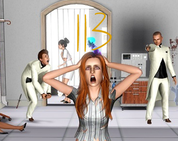 Lidi's thoughts:
Model: 5/5
Set: 5/5
Quality: 4.5/5
Lyrics: 5/5
Storytelling: 8/10
Total: 27.5
Watch out for this newcomer! There's so much going on here and it's definitely fun to look at! Your model for sure looks like she's at an insane asylum! Quality looks flawless here except for that shadow under the stethoscope. That is not in any way a realistically shaped shadow for that object, and if it's being cast by something on the ceiling, that means there would be a light up there and the rest of the stethoscope
should have some sort of shadow. Your model also looks pretty fantastic in her psych ward garb. No complaints on setting- it definitely screamed hospital. The story-telling seemed to mostly fit with your lyrics, but I guess I would question why A) the doctor wants to shoot her, and B) why he shot the other doctor in the foot first. Also I don't understand the ghost.
JJ's thoughts:Model: 5/5
Set: 4.5 /5
Quality: 4/5
Lyrics: 4.5/5
Storytelling: 8.5/10
Total: 26.5
I have to say, I loved your model’s expression, it made me laugh and it fit perfectly with your theme. I loved your set; the only issue with it was the girl who was dead on the left. It looks like she is leaning in the doorway as her back’s support which wouldn’t actually be possible. A little quality issues by your model’s legs and the shading right by the stethoscope. The shading doesn’t fit what the shading would be for the stethoscope. I liked the lyrics you chose but the last line wasn’t completely finished so that’s where the half of a point came off. I liked the storytelling part you were having in your picture. Only thing that seemed odd was the ghosts and the (look-alike-zombie) in the right doorway. Otherwise, I thought this was a great first entry, great job.
Emily's thoughts:Model: 4/5
Set: 5/5
Quality: 5/5
Lyrics: 5/5
Storytelling: 10/10
Total: 29
I really enjoyed this. I only took a point off for your model because I found her pose very unflattering. But that shouldn’t matter much in a comp like this so I only took off a point. I really enjoy the route you took with the song. You didn’t choose very obvious lyrics and I think your picture conveyed the story very well. Great job!
Ghost's thoughts:Model: 5/5
Set: 5/5
Quality: 5/5
Lyrics: 5/5
Storytelling: 10/10
Oh my! I love how you manage to cram so much stuff into every one of your pictures. This was an excellent (and slightly crazy) idea, but I think you pulled it off really well! I’m not sure what the shadow is next to the stethoscope is? Just a tiny thing that my eyes were drawn towards ;) I loved searching this picture, great detail!
SECOND PLACE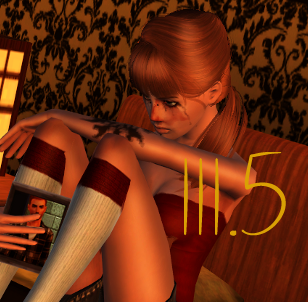 Lidi's thoughts:
Model: 5/5
Set: 5/5
Quality: 3.5/5
Lyrics: 4/5
Storytelling: 10/10
Total: 27.5
This photo was near spot on perfect. Her arm does mesh into her knee a bit and the mascara marks edited in there do look a bit funny and unrealistic, but you told the story well. The lyrics are from a part of the chorus which is a touch stereotypical.
JJ's thoughts:Model: 5/5
Set: 4.5/5
Quality: 3.5/5
Lyrics: 5/5
Storytelling: 10/10
Total: 28
I really loved this picture and your model. She looks depressed and upset, I love it. (In the best way possible, of course). I thought she matched the story you were telling. I also thought the set worked very well as well. Only minor issue is perhaps, make the set a little livelier with more objects, pictures, etc. Only a few quality issues were the girl’s left knee has indent where the arm rests upon it and where the socks by the knees look oddly choppy. I have to say, I feel like you absolutely nailed your lyrics and storytelling. Great job overall.
Emily's thoughts:Model: 3/5
Set: 4/5
Quality: 5/5
Lyrics: 4/5
Storytelling: 10/10
Total: 26
I liked this. I took off a few points for your model only because her face is kind of hard to see and her face appears kind of bloody which I didn’t understand. The site looks really pretty but I could tell it was her bedroom at first. The quality is phenomenal. It looks absolutely stunning. I took a point off for lyrics because you used the chorus and it’s just my personal opinion that using the chorus is kind of a copout. You could have made something amazing out of any of the other lyrics, I’m sure, so I’m just disappointed that you didn’t choose the others. As for storytelling – you aced it! The picture in her hand really made it all come together and the cigarettes and tissues are a great way to show that she’s in pain and feel stressed because of it. I really enjoy this! Good job!
Ghost's thoughts:Model: 5/5
Set: 5/5
Quality: 5/5
Lyrics: 5/5
Storytelling: 10/10
This is my favourite picture. It’s just so warm and yet cold…I just love it. The tears, the photograph, the tilt, the lighting. It’s all so perfect!
THIRD PLACE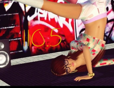 Lidi's thoughts:
Model: 4/5
Set: 5/5
Quality: 5/5
Lyrics: 4/5
Storytelling: 8/10
Total: 26
Wow, what a first entry! I LOOOOOOVE the graffiti - totally 90's. Your model's outfit is cute, but I have to be honest, she doesn't look very much like the model you originally submitted. Her pose is super cute and I love the outfits on the extras and the boombox. Your storytelling was cute here and it definitely related - but only to the first two lines of your lyrics. The second two didn't seem to really be portrayed at all.
JJ's thoughts:Model: 3.5/5
Set: 5/5
Quality: 5/5
Lyrics: 5/5
Storytelling: 8/10
Total: 26.5
I liked the route you took with this picture. The set was gorgeous and really worked. The big thing was with the model. I think it might just be the hair and the color of her hair but it makes her look like a different person. You might want to just watch out for making sure your model looks like the headshot model. No quality issues that stuck out to me so good job on that. I thought the lyrics you chose was a good choice on your part. Storytelling was good but I think it could be improved with more connection with all the lines that you chose. Great first entry.
Emily's thoughts:Model: 5/5
Set: 5/5
Quality: 5/5
Lyrics: 5/5
Storytelling: 8/10
Total: 28
I really enjoy this. Your model looks stunning and I really like how well her look compliments the situation and the setting. The setting is also really straightforward and vibrant. I love it. Your quality is stunning. Everything is perfect clear and looks great. The lyrics fit well with your picture and I only took a few points off for storytelling because I feel that there wasn’t much story to capture in the song to begin with and the lyrics you chose are partially about the narrator rapping or creating music when your character is only dancing. But I really enjoyed your picture and I think you did a great job! :D
Ghost's thoughts:Model: 5/5
Set: 5/5
Quality: 5/5
Lyrics: 5/5
Storytelling: 10/10
Love this picture. They’re all so hipstaarr ;) I seriously love your model’s outfit though, I want it! Great set, lots of colour. Lovely!
FOURTH PLACE - Tie!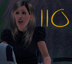 Lidi's thoughts:
Model: 5/5
Set: 3/5
Quality: 4/5
Lyrics: 5/5
Storytelling: 10/10
Total: 27
This was a really great idea for this song. Totally out of the box, really unique, and very well done. My only big complaint is your setting. Random mountain-y area with some broken wood just doesn't do the rest of the photo justice. There also is a slight quality issue with the back of the vampire's jacket (but I feel that also has a lot to do with the low-lighting situation) and Ellie's right eyelash is meshed weird.
JJ's thoughts:Model: 5/5
Set: 4.5/5
Quality: 4.5/5
Lyrics: 5/5
Storytelling: 10/10
Total: 29
I'll admit, I laughed pretty hard when I first saw your model's face. A kind of creepy set but I feel like there could've been more in the set. Only quality issue I saw was the male's pants is showing through his shirt. Just something to watch out for. Lyrics and storytelling was spot on, great job.
Emily's thoughts:Model: 4/5
Set: 3/5
Quality: 4/5
Lyrics: 5/5
Storytelling: 10/10
Total: 26
Pardon me while I applaud. I saw your picture and when I scrolled down and saw those lyrics I could’ve kissed you. The amount of storytelling you put into this is absolutely phenomenal and I adored that. I wish I could’ve given you a perfect, but sadly there are other factors to take into account. Your model is lovely, but her facial expression is really funny and the song is very serious so I find it to be very out of place. Your set isn’t clear. It just seems like she was randomly bitten. It could have been better if maybe you had her in a very gothic mansion being bitten where it would seem that she actually went to a vampire to achieve her goal to be have such perfection which would make sense. I took off for quality because your pic was really small but that’s the only problem I had with that. I’ve already told you how much I loved your lyrics and your storytelling. Seriously. I have a huge smile on my face. I love that song and you just twisted the meaning into something really, really beautiful. Bravo. Can’t wait to see what you come up with in the future!
Ghost's thoughts:Model: 5/5
Set: 4/5
Quality: 4/5
Lyrics: 5/5
Storytelling: 10/10
It think this was the best use of lyrics. It’s also one of my favourite songs ;) I wish your set had been a little more interesting, grass isn’t the prettiest thing to look at. But her expression, oh, I love it so much. MAJOR DERP FACE.
 Lidi's thoughts:
Model: 5/5
Set: 3/5
Quality: 4/5
Lyrics: 5/5
Storytelling: 8/10
Total: 25
I was SO EXCITED to see what lyrics you would pick with Hanson. And let me tell you, I'm sure glad it wasn't Mmmbop, ba duba ***, Ba du bop, ba duba ***, Ba du bop, ba duba ***, Ba du, Yeah. The picture in a picture is cute to show your storytelling, but overall didn't blend in there super well. It seemed more like something stuck on the corner at the end. Quality was affected a little bit by the guy's hair meshing through his collar and her hands meshing into his head, but nothing was overly blurry so that was good. I liked that they were on a bridge at night, which was cute, but I feel so much of the picture is just expansive water and sky that it makes it a teensy bit boring setting wise.
JJ's thoughts:Model: 4.5/5
Set: 5/5
Quality: 4/5
Lyrics: 4.5/5
Storytelling: 10/10
Total: 28
I really liked how adorable your model looked. It’s probably just the lighting but her hair looks a different color, just something to watch out for. Your set fits the picture very romantically and I thought it fit very well. It was plain and simple. There were some quality issues with the male’s hair and the male’s hand. It just looks awkwardly not there. Perhaps, it’s just me or the coat making it look like that. I really liked the lyrics you chose but cutting out a few words can change the meaning of it, only reason why you got half of a point off. I liked the added picture in the corner of them older but I feel like your picture could’ve got without it as well. With your explanation, the lyrics and the picture, I could see the relationship you were showing. I did like your story and what you were telling. Excellent job.
Emily's thoughts:Model: 4/5
Set: 4/5
Quality: 4/5
Lyrics: 4/5
Storytelling: 10/10
Total: 28
Let me start off by congratulating you on doing well with such a crappy song. If I got Hanson, I would have probably started crying because lyrics to such a song are very difficult to make any kind of story out of. But you did it quite well. I like how you have a picture of them when they’re elders and they’re still together it ties into the lyrics brilliantly. I took off a point for your model her face is kind of taken over by the back of his head and in the picture of her as an elder she’s too far away too see well. I took a point off for quality because her fingers are being eaten by his head and I took a took off a point for lyrics because they throw me off a little. Your picture looks like your model already knows who cares, but the lyrics partially seem like she didn’t know in the past but knows now that they’re still together at such an old age. Overall, you did well in getting your story across. Good job.
Ghost's thoughts:Model: 5/5
Set: 4/5
Quality: 5/5
Lyrics: 5/5
Storytelling: 10/10
Awwwww! This is possibly the sweetest thing I have seen. It’s just so cute! Just one tiny little thing! The old couple picture’s background is very grey, and I wish the picture had been just a little bigger. Other than that, I just, gah! It’s so darn cute!
FIFTH PLACE Lidi's thoughts:
Model: 5/5
Set: 3/5
Quality: 4.5/5
Lyrics: 5/5
Storytelling: 10/10
Total: 27.5
Oh goodness Ruby how I love this photo. Favorite of the round. It had so much emotion. Reading it with the lyrics actually made me tear up a bit and her mascara runs were fantastic. I also love how you didn't have to explain anything. It completely told a story all on its own. THIS is the kind of picture this competition is made for. My only complaint with anything is your setting. It's so random and very plain. Right outside the door to the house, or in an airport, or even just in front of a taxi would have been better. But this photo hit right on the money.
JJ's thoughts:Model: 5/5
Set: 4 .5/5
Quality: 5/5
Lyrics: 5/5
Storytelling: 9/10
Total: 28.5
This picture was so sad. Your model looks crushed. Set was kind of plain and simple. Possibly you could live it up a little. Also, it kind of looks odd that he is practically smiling while saying goodbye to her. I thought you chose good lyrics for your picture. Storytelling I thought was really good this round. Great job.
Emily's thoughts:Model: 3/5
Set: 2/5
Quality: 5/5
Lyrics: 5/5
Storytelling: 10/10
Total: 25
Awww. That’s a really sad story. And you told it very well in your pic. I also enjoy the direction you went with the song and that you didn’t pick the chorus! I took points off for your model because she’s facing the side which makes her hard to see. The set is really unclear. You could have had them standing in front of the door to their house or something to show that he’s leaving. Your picture quality is lovely and I really enjoy it. Good job!
Ghost's thoughts:Model: 4/5
Set: 4/5
Quality: 5/5
Lyrics: 5/5
Storytelling: 10/10
I loved the idea behind this, and your models are almost perfect, but I’m not sure why the man is smiling? I would be a little upset if I was leaving my girlfriend behind as I went off to war! Excellent quality, though, and great tears! The background could have been a little more interesting, I felt, but great execution!
SIXTH PLACE - Tie! Lidi's thoughts:
Model: 4/5
Set: 3/5
Quality: 5/5
Lyrics: 5/5
Storytelling: 9/10
Total: 26
So excited to have you back Alathria! And what a picture to start with! You've for sure gotten way better at the tear thing since last cycle. She looks so good! I am confused about her outfit however, as she seems in a posh place (couch + chandelier) and the extras are dressed up, but she seems to be in an 80's sweat crop-top? While the set is nice and interesting, I'm not 100% on where they are supposed to be. I love the storytelling here. Her expression is perfect. The only thing that bothers me a tiny bit is that, while I ADORE that you did Luna-ception (lol), I feel that the two girl's hair colors are basically exactly the same and it almost makes it look like you tried to have her looking at another side of her self or something which is a bit confusing. Overall, I loved it though!
JJ's thoughts:Model: 4.5/5
Set: 4/5
Quality: 5/5
Lyrics: 5/5
Storytelling: 8.5/10
Total: 27
I do have to say I love your tears! (It sounds terrible I know but it's so true) Only thing is that her hair looks lighter in this picture, it's probably the lighting or the hair style but just something to watch out for. I liked the set a lot. It was colorful, lively and helps explain your story. The only question I was left with was where they were. Is she sitting in their living room crying while they are kissing? Yet again, just a reminder to watch out for these things. Quality looked great. I like the route you were taking for this picture. But the only line that struck me as odd "I'm choosing my confession" because she wants to tell him but is crying while watching instead so she isn't really confessing her love to him. I really loved your picture though.
Emily's thoughts:Model: 2/5
Set: 3/5
Quality: 5/5
Lyrics: 5/5
Storytelling: 8/10
Total: 23
The first thing I noticed here was that both of the girls in the picture are red heads. That's really confusing. At first glance, I didn't know which one your model was until I looked at the headshot you submitted of her at the start of the comp. Then I noticed something else which made me take points off for your model: she isn't changed from her original clothing. I think you could have changed it to fit a certain mood in the picture for better effect. :) As for points lost for set, I didn't really get it. From the lyrics you chose and what I could get from this situation is that your model is being cheated on by her boyfriend and thus is trying to keep an eye on him or was cheated on by her boyfriend and now can't stop watching his every move. I understand the story, but the living room scene throws me off. I think you could have improved your setting by putting them in a place where it would seem more like she was watching from afar. For example, have her be looking into a window through which the two others are kissing. The quailty of the picture was great, though! The tears on her face look really nice and the image is very vivid. I took a few points off of storytelling for the fact that I wasn't sure if she was currently being cheated on or was cheated on in the past. But you did a great job, regardless! Your model is very pretty. :) Next time try and change her up a bit to fit the story and really think about your setting.
Ghost's thoughts:Model: 5/5
Set: 5/5
Quality: 5/5
Lyrics: 5/5
Storytelling: 10/10
Your model just looks so pretty in this picture, I love it! It has just the right tilt, just the right shine. It’s wonderful. The other girl also being ginger makes me want to think they’re sisters or twins (Are they?!) but other than that, I WUVS IT.
 Lidi's thoughts:
Model: 5/5
Set: 4/5
Quality: 5/5
Lyrics: 5/5
Storytelling: 7/10
Total: 26
I like the lyrics you chose and how you chose to portray them. I just don't think it completely worked execution-wise. The set was beautiful, but what's the point of having such a nice fancy wedding if no one's going to go to it? I think if you were going for such a wide angle, there should have been some extras. Apart from that though, I think it would have been eons more effective for a closer up shot. You can't really see their expressions which I would find nice for such loving lyrics. Quality was spot on though, and Diva looked fabulous.
JJ's thoughts:Model: 5/5
Set: 4/5
Quality: 5/5
Lyrics: 5/5
Storytelling: 9/10
Total: 28
I have to say, I adore your model, she looks stunning. I simply love your set but it did strike me odd that there was no one was around besides the two of them. I liked the lyrics you chose and I really liked your picture. The storytelling part was excellent and I think you were practically right on the dot. I think this an excellent picture but perhaps just make sure you live your set up a bit more.
Emily's thoughts:Model: 4/5
Set: 4/5
Quality: 5/5
Lyrics: 5/5
Storytelling: 8/10
Total: 26
First off: I love your model! I think she looks stunning! Only problem is that I can’t quite see her face because she’s so far away, thus I took a point off for your model. I also took a point off on your set because it’s very obviously a wedding and I think you decorated the room very well…but there are no guests! What kind of wedding is this? :P With such a setting, I find guests to be a big part of your set. The quality was fine. Your picture is clear and looks lovely. The lyrics you chose are perfect for your picture, however I took some points off for storytelling because though the pic does show them being married, but your picture doesn’t show any sign of her “giving in.” Because that’s basically what the first three lines you chose are – the narrator just wants to love their significant other but they want to be married…well there’s nothing I can do… You know what I mean? But I do still love your picture and your model. Good job!
Ghost's thoughts:Model: 3/5
Set: 4/5
Quality: 4/5
Lyrics: 5/5
Storytelling: 10/10
Just some advice, this picture would look great more zoomed in and centred on the couple. It’s a wonderful wedding scene, it just needs some perfecting with the angles.e had been just a little bigger. Other than that, I just, gah! It’s so darn cute!
SEVENTH PLACE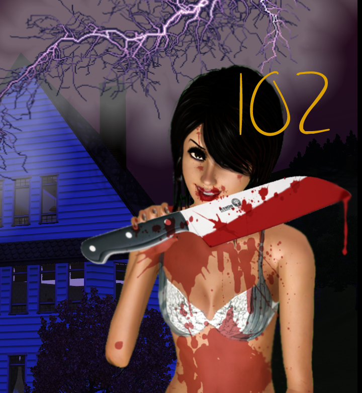 Lidi's thoughts:
Model: 5/5
Set: 5/5
Quality: 1.5/5
Lyrics: 5/5
Storytelling: 10/10
Total: 26.5
Your model looked so creepy awesome in this pic. I loved it. And I loved the blood splattered all over her. And the way she looks like she just murdered everyone in that pleasant little house. AWESOME. However as you predicted, the lighting and knife threw your score off. In fact, until you sight it was lighting, I thought it was some confusing white tree >.< The knife still as a bit of it's white outline going on and isn't in her hand in the slightest. Also on the right side your model still has some of her green screen showing on her. However with the proper editing, this pic could have been totally ballin because the idea was so there.
JJ's thoughts:Model: 4/5
Set: 3/5
Quality: 3.5/5
Lyrics: 4/5
Storytelling: 8/10
Total: 22.5
This picture looks wicked which I found really unique. The major issue though was a lot of this picture kind of looks very cartoonish. The blood on your model is an example of this. Even with that, she looks great and really looks insane which I loved. The same cartoonish issue I stated before especially around the edge of the house and trees. A big thing on your quality was the lightening. It worked really well but parts of it are over the house. The lyrics felt kind of short but I felt like they were a good choice. Your storytelling was great but I feel like there could've been more connection with lyrics. Good job overall.
Emily's thoughts:Model: 5/5
Set: 4/5
Quality: 2/5
Lyrics: 5/5
Storytelling: 10/10
Total: 26
I really like the direction you went with the song. Your model looks delightfully evil and I just love it! Your set is nice, but the lightning throws me off a little. Your edits took your quality score down majorly. The knife really bothers me (I’m sure you are bothered by it as well based on your comment). It’s very obviously not in her hand and there are various items of CC that you could download that are daggers and such that would have made that look a lot better. Also, the flash of the lightning you tried to create looks more like smoke. I did, however, really like the blood. Your lyrics, though short, actually add a lot to the photo which surprised me. Your story is very awesome and, as I said, I like how you went down a very unique route with your lyrics. Good job!
Ghost's thoughts:Model: 4/5
Set: 4/5
Quality: 4/5
Lyrics: 5/5
Storytelling: 10/10
Too much editing, or possibly too obvious editing. I felt there was just too much blood, and the splatters were unrealistic. Also, that knife – She seems to be holding it with only her pinkie finger :lol: I would just take care in overdoing it. The house and girl are sufficiently spooky though, and this really is something from a horror movie!
EIGHTH PLACE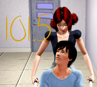 Lidi's thoughts:
Model: 3.5/5
Set: 2/5
Quality: 3.5/5
Lyrics: 5/5
Storytelling: 8/10
Total: 22
This picture is so sweet Aalyoko. The loving looks they're giving each other and how she's pushing him and he's in his hospital gown. It makes me awww. I think it does a god job of expressing your lyrics too, even though there isn't really a lot going on or anything to show that he isn't/wasn't perfect or how he deserves love. My major problem here is the setting. You've gotten back into your anti-decoration habit, lol. Aside from that, there's a few problems with the poses like borked wrists on your model and his shirt cutting into his fore-arm. Also the door directly behind them looks...sad? It's warped downwards on the bottom window. I have no idea how you even got it to do that. Lol
JJ's thoughts:Model: 5/5
Set: 3.5/5
Quality: 4/5
Lyrics: 5/5
Storytelling: 9/10
Total: 26.5
I have to say, I loved your model’s expression. She looks like she is really enjoying her time with him, if that makes sense. It fit the route you were taking well. I could definitely tell that your model was in the hospital but I felt there should’ve been more in the set itself. I got the idea of the place but perhaps add a nurse, another patient or something else to add more into the set. Some minor quality issues with her left wrist and on her arm. I adored the lyrics and the story you were going for. I thought it was a take on the lyrics that I didn’t think of when I first saw the lyrics. Great job.
Emily's thoughts:Model: 3/5
Set: 5/5
Quality: 4/5
Lyrics: 5/5
Storytelling: 9/10
Total: 26
Your model is quite lovely, but I was a little sad that you didn’t change her like I got on Alathria for not doing. But I do love the expression on her face. I think it really captures the emotion that the lyrics you chose are conveying. The set is great. I was going to say someone may not be able to tell it was a hospital, but with him in a wheelchair it’s kind of obvious. I really like the direction you took with the song. A Salt N’ Pepa song is definitely rough to grab a story from but I believe you really came through. I took a few points off for quality only because right behind your modeling one of the windows on the door is really noticeable strange looking. Great job, though. I quite enjoyed this pic.
Ghost's thoughts:Model: 5/5
Set: 3/5
Quality: 4/5
Lyrics: 5/5
Storytelling: 10/10
I love how you used these lyrics, however I think you sharpened this picture too much. The quality is a little off, and I hate to say the set is boring. I love the wheelchair/hospital gown combo, though – maybe add some flowers or other hospital related things next time?
NINTH PLACE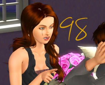 Lidi's thoughts:
Model: 5/5
Set: 4/5
Quality: 4/5
Lyrics: 4/5
Storytelling: 7/10
Total: 24
I want to start by saying I LOVE that mascara streak running down her face! Anyhow, model looks good, set looks....ok. Quite plain, but then again maybe some people don't have a lot of decoration in their home so...whatever. Quality wise, meshing got you a bit. Her elbow is borked and her hair has a bald spot in the top that could have been fixed with smudging. Your male also has an issue with his biceps eating his sleeves. As far as storytelling goes, I can see their in an argument and he doesn't want to listen so the falling apart makes sense, but not so much the way it used to be. How did it used to be? Even an in game picture placed beside the flowers with a picture of them looking happy together would have related to this line.
JJ's thoughts:Model: 4.5/5
Set: 4/5
Quality: 4.5/5
Lyrics: 4/5
Storytelling: 9/10
Total: 26
I liked your picture a lot, I have to say. Only suggestion for your model is to actually show a little of tears in her eyes. Because I'd imagine it would be more than just one tear, you know? Your set was pretty plain and simple. Might want to spice it up or add a little more to the background. A little quality issue I thought with the male's left arm (around the elbow area). I liked the lyrics you chose but they kind of felt short (and safe which is fine). I think you can try getting longer and more difficult lyrics. However, with the lyrics you chose, I thought you nailed it. Great job.
Emily's thoughts:Model: 4/5
Set: 3/5
Quality: 4/5
Lyrics: 2/5
Storytelling: 7/10
Total: 20
I took off points for your model and quality for the same reason. She has a strange transparency problem going on with the top of her head which is distracting. But she looks fine otherwise. Your set is kind of boring, but it makes sense when you take into consideration what your picture is about. I didn’t like your lyrics because I feel like you couldn’t work very well with just those two lines. I took off a few points for storytelling also because, though I get that she’s yelling at him there’s really no telling what the “way that it used to be” is. Without that it just looks like a petty argument. I didn’t see any depth to it. It nice, though. Good job and good luck with the rest of the comp.
Ghost's thoughts:Model: 4/5
Set: 5/5
Quality: 5/5
Lyrics: 4/5
Storytelling: 10/10
Try taking your shots from a flat plane or slightly tilted only, as generally above shots don’t look quite as nice. I really loved the tears (Very well done!) and your model. The background was great just try and get some extra special things in there! I would have loved to maybe have seen more od your male model, and there’s some sharp edge things on your arm, but this is a great start!
TENTH PLACE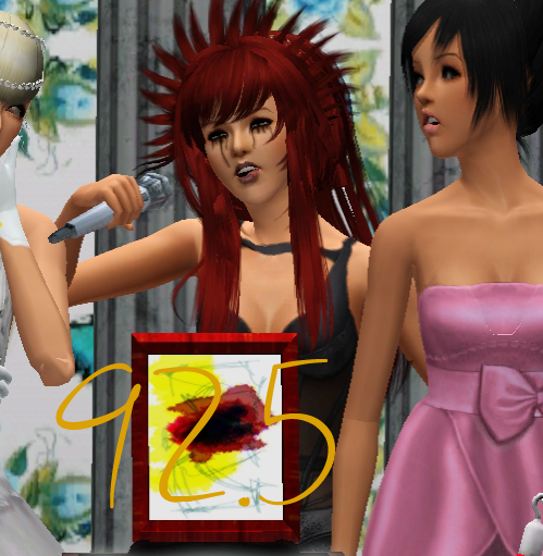 Lidi's thoughts:
Model: 3/5
Set: 4/5
Quality: 5/5
Lyrics: 5/5
Storytelling: 5/10
Total: 22
So one thing I feel that everyone should be aware of is that I don't take any sort of stories/descriptions into account when I judge. The point isn't to make up a story to go with the lyrics - it's to be able to portray your idea of the lyrics with only the picture. Although you had absolutely no idea of knowing this round one. But that's why I make it non-elim - so it doesn't hurt anyone :). Without what you typed, I have no idea what this picture means/what it's doing/how it relates to the lyrics. And your lyrics talk about a male figure that's nowhere to be found in the photo. Moving on, the quality here was fantastic. This photo was also very creative. You're model's hair is a bit wild in the middle shot, but her tears look good and I love the blonde girls pose.
JJ's thoughts:Model: 4/5
Set: 5/5
Quality: 3.5/5
Lyrics: 5/5
Storytelling: 6/10
Total: 23.5
I liked your model but I found it odd she is crying for both of “what she was” and “what she is”. I loved your set though, excellent job on that. Some quality issues with the “ghost looking” girls. The girl on the right, apart of the column is coming into her chest. Also the girl on the left, her face has blue on the right side and some parts are see-through while the rest aren’t. I liked the lyrics you chose and the story you were telling. I felt however that you didn’t reflect the lyrics you chose. You didn’t actually reflect the gender you were talking about. It was a good story but didn’t actually represent the lyrics. This was a great picture with only minors problems that can be improved upon, good job overall.
Emily's thoughts:Model: 2/5
Set: 4/5
Quality: 5/5
Lyrics: 1/5
Storytelling: 8/10
Total: 20
I didn’t like this very much. Your model really threw me off because of that hair. I understand that she’s supposed to be drunk, but if you hadn’t explained that and I was just going by the lyrics I would have no idea what on earth was going on with her or what was going on in the picture in general. I normally really like things I have to think about, but I feel that instead of being deep your picture was being confusing. And I think your model is so pretty and your picture did her no justice. The set is okay, but again if you hadn’t explained it to us I wouldn’t know where on earth they were. So that’s why I took a point off. Your photo quality was fine. As far as lyrics are concerned, I’m glad you didn’t pick the chorus like most would, but I dislike that you changed the ‘he’ into a ‘she’ in your photo. I also don’t feel like the lyrics had much of a connection to the photo other than you can kind of tell in your photo that the girl in white is degrading your model in some way because she appears to be laughing. However, I gave you an 8/10 for storytelling because you put a lot of effort into taking those lyrics and attempting to make something out of them and I greatly appreciate the fact that you are willing to be so creative with your pics. Better luck next time! I’m sure you’ll grow as the comp goes on. You have great potential.
Ghost's thoughts:Model: 5/5
Set: 5/5
Quality: 5/5
Lyrics: 4/5
Storytelling: 8/10
I got a little confused here…I don’t understand why it’s a she speaking when the lyrics say “he” or what the little scrawled painting is. I think I sort of get it, but…? Your models do look very good though, and if this is supposed to be an awards ceremony (?) then good job with the set-up!
ELEVENTH PLACE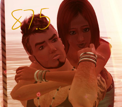 Lidi's thoughts:
Model: 5/5
Set: 3.5/5
Quality: 5/5
Lyrics: 3.5/5
Storytelling: 4/10
Total: 21
This photo is sooo pretty. I love the editing, the filter, the light swooshes that make the two pictures blend as one....it's all so awesome. But it looks more like modeling than story-telling. There's really almost none at all. On the left he looks resistant to be with her, not wishing to be with her. And on the right no one looks like they're making any sort of impression or rubbing anyone to be honest. Quality is spot on, and your model looks gorgeous. The set doesn't really make sense with a swing by the water, but it is pretty so not to bad. But all in all this looks more like a modeling photo. If you focus on the storytelling aspect in the future, you'll go far in this competition.
JJ's thoughts:Model: 5/5
Set: 4/5
Quality: 2.5/5
Lyrics: 5/5
Storytelling: 8/10
Total: 24.5
I have to say, I really liked your picture. I also like your model, she looks gorgeous if I do say so myself. The set sets that very tempting and loving mood that is really was needed in your picture. I feel though the separation of the two “pictures” could’ve been a more improved separation. Only some quality issues that occurred which can be watched out for. Left side, the girl’s hair is coming through her arm, her left hip looks oddly inward, and it looks like water is on her legs. Right side, the one arm looks like it is, and the water also looks like it’s on top of them. Perhaps, it is suppose to be like that, but it also leaves the one question I had, how does the swing fit in? There is no visible way it’s on the water. That is just something I’m pointing out. I liked the lyrics you chose which really clicked with the picture you made. Overall, I really liked your story that you were telling. I was impressed with how you presented (which was very unique) and it helped your storytelling. I think this was great start for cycle 2. Great job.
Emily's thoughts:Model: 3/5
Set: 4/5
Quality: 5/5
Lyrics: 1/5
Storytelling: 0/10
Total: 13
I liked the editing and I thought that your picture looked really pretty, but I felt like it had seriously nothing to do with the lyrics and thus had really no story. Hence, why you got a zero for storytelling and a one for lyrics. But the one for lyrics is also something that I understand is partially not your fault…but it bothered me. If you look at all of the other pictures the lines are really short. The ones you chose (also the chorus which I’ve made clear I find to be a copout) are really, really long. I understand that you probably found them this way, but if I were you I would have made the part after each comma a new line. I’m sure you can see that you have an advantage in allowing those to all be one line each – you have way more lyrical content to work with. That kind of made me angry. Your set is pretty, but I took off a point because I didn’t get it’s relation to the lyrics. Your model looks nice, but I took off points because the lighting makes her features hard to see on one side and on the other she’s not facing the camera at all. Overall, I feel like you just created a picture of some girl with her guy. It didn’t fit the lyrics and I saw no storytelling going on whatsoever. I’m sorry if I sound like a jerk, your photo editing and taking skills are awesome but I just wish you would work on storytelling and lyrical connection. I wish you the best of luck in the remainder of the comp and hope that you grow better as it goes.
Ghost's thoughts:Model: 5/5
Set: 5/5
Quality: 5/5
Lyrics: 5/5
Storytelling: 9/10
Amazing editing! I took one point of for storytelling because it’s more of a modelling shot, rather than story shot, but it looks amazing.
TWELFTH PLACE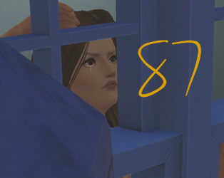 Lidi's thoughts:
Model: 2/5
Set: 2/5
Quality: 5/5
Lyrics: 5/5
Storytelling: 7/10
Total: 21
Oh Eggy. What a fantastic idea and great way to show all the lyrical lines used. But it sort of died with whatever is completely obstructing the picture. I can't properly judge your model or the set because....I can't see it. Although with your model I do have to say her face sort of bothers me. She doesn't look like she's being killed or believing. But the tear did help immensely. I don't really know what else to say about this photo. I get the idea and it was lovely but that thing. It's just...there. It's taking up SO MUCH of the photo, lol. I think if you watch out for that next time, you'll have a much better time producing a gorgeous photo.
JJ's thoughts:Model: 5/5
Set: 2.5/5
Quality: 5/5
Lyrics: 5/5
Storytelling: 8.5/10
Total: 26
Your model looks great. Don't worry about the tears, they look fine. Maybe make them less milky looking and longer. I really liked your picture but every time I see it, it makes me think: why is that darn piece of house blocking the picture? That was my major problem because it didn't allow visible of all the model and set that was there. Lyrics and storytelling were great points for you. I think maybe try to have more connection with lyrics and picture. I could see it there but I feel like it could be a little stronger. I think this was a great first entry, good job.
Emily's thoughts:Model: 3/5
Set: 0/5
Quality: 3/5
Lyrics: 3/5
Storytelling: 5/10
Total: 14
Oh my goodness XD What is that thing obstructing my view? That’s the main reason I took off for your set and your model. I can’t really see your set or your model that well because there’s this concrete structure attempting to eat them. The lyrics are alright, but I didn’t see much connection to your picture (which is also why I took off for storytelling) and, I know I keep hounding people on this, it’s the chorus. I just can’t appreciate chorus lyrics. My problem with this was that you were almost without a set because it was being smothered and I see that she’s sad and looking out the window and I see that you’re attempting to tell a story with it but it isn’t very effective. And she looks more angry than sad and the lyrics make me think she would look very sad. The only hint of sadness is the tear. I really like your model, though, and hope to see you grow as the competition progresses. You worked hard. I hope you’ll come up with something great next time. And let’s avoid vision obstructing concrete things! ;)
Ghost's thoughts:Model: 4/5
Set: 3/5
Quality: 4/5
Lyrics: 5/5
Storytelling: 10/10
This was an excellent idea, I just wish the fencepost wasn’t covering the whole picture! I can see almost nothing of your model! Close-up shots on objects generally don’t look as good – you can see the texture-weirdness on the post. This would have been so good if you had just made the fence post a little further away, or a little further out of shot.
THIRTEENTH PLACE 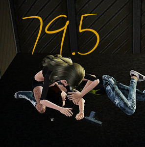 Lidi's thoughts:
Model: 2/5
Set: 2/5
Quality: 4/5
Lyrics: 3/5
Storytelling: 8/10
Total: 19
This picture I think started out with a good concept and then went downhill. The background was quite boring and not set up well. The distance from the subjects is making them look pixely. And to be honest, this picture is totally focused on the boy and not your model at all. She almost seems like an after thought. This would have been 20 times better if she was the angel and the boy was the random extra. Apart from that, I get where you were going, but you also used the chorus of the song which, while allowed, is not particularly out of the box or creative. But I can see you have unique vision which will serve you well in this competition :)
JJ's thoughts:Model: 3/5
Set: 5/5
Quality: 4.5/5
Lyrics: 5/5
Storytelling: 7 /10
Total: 24.5
I really liked your picture when I first saw it. However, then I looked at your model and my hopes kind of dropped. Unfortunately, the girl you used looks nothing like the model you submitted. That’s really important to watch out for. Perhaps it was the editing used on your model headshot but it honestly doesn’t look like yours. I did like your set a lot. It really helped with your storytelling. Just a suggestion, maybe have the “dead boy” have more a ghostly look because just looking at it, it looks like they are all completely there and can be seen by each other. Only issue with quality is the wings of the angel boy are coming into the ground. I thought you picked good lyrics that helped bring your story together. I feel a little bit that your picture story and lyrics story are a little different. Possibly watch out for that. Overall, I think this was a good picture and a great start for this competition. Good job.
Emily's thoughts:Model: 0/5
Set: 0/5
Quality: 2/5
Lyrics: 3/5
Storytelling: 9/10
Total: 14
You’re going to hate me for this. :/ I didn’t like this much at all. I gave you a zero on your model because she may as well have not been in the picture. My eyes automatically were attached to the guy with the angel wings in the corner. That shouldn’t happen. My attention should be immediately drawn to your model. Also, I believe you changed her hair color which is against the rules. If you didn’t change her hair color, then you didn’t edit it to even look like the same color so I’m just left to assume that it just isn’t. Your set is in no way clear. Where are they? Someone’s garage? An alley? I can’t tell in the least and the space is very, very empty leaving me to be absolutely stumped. I gave you such a low score for quality because some parts look very blurry to me and otherwise there’s nothing for me to look at to determine quality. As for lyrics, I took points off because I think you could’ve picked a different part of the song. I find choruses to be kind of a copout. Storytelling was your saving grace (and the fact that this round isn’t elimination). I really really really enjoyed the thought you obviously put into this. Your effort in that aspect is quite commendable and I give you a thumbs up for that. As for taking a point off, that’s only because I didn’t know the two boys were the same person at first which confused me. I hope you don’t take any of this the wrong way. I know what it’s like to have your work critiqued like this so I want you to know that I in no way mean this to sound harsh. I look forward to what you’re going to give us later and hope to see you improve as the comp goes on. Good luck and good job.
Ghost's thoughts:Model: 4/5
Set: 3/5
Quality: 4/5
Lyrics: 3/5
Storytelling: 8/10
First point: Lighting; really try and make sure everything is very clear in your picture. Right now I can’ really tell whose legs belong to who and it just seems very dark, your setting could use some decoration, too. Try and get A better angle. Generally shots from above don’t look as good. I don’t understand what’s happening either. Sorry if this seems a little harsh, but I just have no idea what’s going on. Clearly someone shot the guy on the floor, and the girl is crying, but is the angel (Why is there an angel?!) telepathizing? Who is going to be the one that saves him? I really look forward to seeing your next picture though, and do you know how to use cameraman mode?
435q - ScratchNatrules12 - ScratchWhat_Red - ScratchCinderpelt - ScratchDancerbakersimlove - ScratchELIMINATEDNo one this round :D 


 Emily433113 years agoSeasoned AceLook how long my freaking explanations are. XD Oh well, it's better than nothing. I hope they help you guys understand your score from me and help you get better. I tried my best to give you constructive criticism instead of just criticism.